Coca Cola Pop
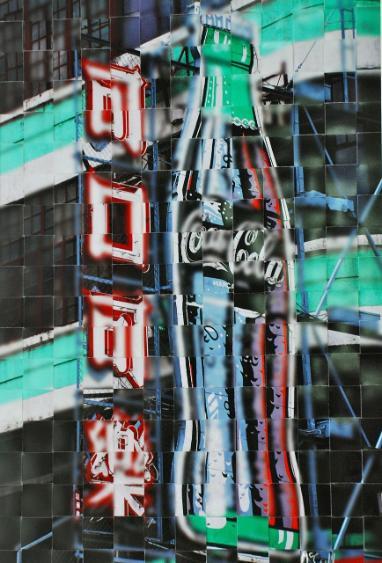
Eleanor McColl

Campus Art Collection : A Sense of Place
Introduction
Visual Analysis
Introduction to “Coca Cola Pop” by Eleanor McColl
Welcome to our exploration of a captivating piece of art entitled "Coca Cola Pop," created by the talented artist Eleanor McColl. As you gaze at this artwork, what stands out to you first? You might notice the striking interplay of sharp focus and deliberate blur, which creates an intriguing visual experience. At its center is a vibrant Coca-Cola sign, accompanied by Chinese characters, set against an urban backdrop. This combination highlights the powerful presence of the Coca-Cola brand in city life and invites us to think about themes of consumer culture and identity. How do these elements interact in your mind?
At first glance, the Coca-Cola sign is immediately recognizable, a symbol of a brand that has transcended borders and cultures. Coca-Cola is not just a beverage; it represents a lifestyle and a sense of enjoyment. The bold red and white colors of the sign are eye-catching and evoke feelings of excitement and refreshment. Do these colors evoke any memories for you? In many ways, Coca-Cola has become a universal icon. However, the addition of the Chinese characters adds a unique perspective, prompting us to consider how international companies adapt their marketing strategies to resonate with local cultures.
The use of Chinese characters signifies the importance of localization in branding. By incorporating the local language, Coca-Cola demonstrates an understanding and respect for the culture it engages with. How does this strategy help the brand connect with consumers in your view? It creates a sense of familiarity and familiarity is key in a globalized world. For viewers, the sign becomes a bridge between global and local identities, allowing us to reflect on how cultural elements intertwine within a commercial context.
The technique of splicing two photographs together adds further depth to the artwork. This approach challenges traditional viewing. By combining these two perspectives, how do you think the viewer is encouraged to interpret what they see? The blurred elements may symbolize the fleeting nature of memory and experience, suggesting that not everything in our world is as clear as it seems.
This artwork also prompts discussions about the role of advertising in society. In an age dominated by marketing, images like this challenge us to think critically about what they represent. The Coca-Cola sign is not just a commercial product; it embodies a lifestyle, a social experience, and even a form of cultural exchange. How do you think advertising influences our perception of culture and identity?
Moreover, the background of the building adds context to the scene, suggesting an urban environment where commercialism thrives. Buildings like this are often filled with shops, restaurants, and cafes, creating a lively atmosphere. The presence of the Coca-Cola sign reinforces the idea that such brands are deeply embedded in our daily lives. They shape not only what we consume but also our environments and experiences. Have you ever thought about how brands influence your daily life?
In conclusion, this artwork offers a rich exploration of cultural identity, globalization, and the impact of advertising. By combining the Coca-Cola sign with the Chinese characters, McColl creates a dialogue between global branding and local culture. The use of two photographs—one in focus and one slightly blurred—adds complexity, prompting us to reflect on the interplay between clarity and confusion in modern life. This piece encourages us to think about how commercial images shape our understanding of culture, identity, and community. How might this artwork inspire you to look at the symbols around you in a new light?
Visual Analysis of "Coca-Cola Pop" by Eleanor McColl
As we delve into Eleanor McColl's artwork "Coca Cola Pop," let’s begin by closely examining the visual components that make this piece so compelling. What do you notice first? At first glance, you may see a striking Coca-Cola sign, a symbol that is globally recognized, prominently integrated with Chinese characters against an urban backdrop. This combination creates a blend of clarity and blur that draws us in. Each element—from lines and shapes to color and texture—works together to create an engaging visual experience.
Let’s start by discussing lines. In this artwork, you’ll notice both straight and curved lines. The bold edges of the Coca-Cola sign are defined by straight lines that create a strong presence. How does this strong presence affect your initial impression? In contrast, the blurred areas introduce softer, curved lines that evoke a sense of movement and fluidity. These lines guide the viewer’s eye across the composition, moving from the sharp focus of the sign to the more abstract background.
Next, let’s look at shapes. The artwork features a mix of geometric shapes, like the rectangular forms of the sign and the building, alongside more organic shapes emerging from the blurred background. How do you think this interplay between shapes affects the overall message of the artwork? The arrangement of these shapes not only defines the Coca-Cola sign but also contextualizes it within the bustling life of the city.
Now, let’s analyze color. The color palette in "Coca Cola Pop" is bold and vibrant, dominated by the iconic red and white of the Coca-Cola brand. These colors evoke feelings of excitement and refreshment. Do any specific colors stand out to you? The addition of green and blue hues in the blurred background introduces contrast, enhancing the visual impact. This use of color theory—particularly the complementary relationship between red and green—adds emotional depth to the piece.
Moving on to texture, the surface quality of this artwork is fascinating. The Coca-Cola sign appears glossy and smooth, while the blurred background has a softer, more diffuse quality. How does this contrast in texture influence your engagement with the piece? This juxtaposition enhances the overall composition, drawing attention to the sign while suggesting the ephemeral nature of memory and experience.
Next, consider the use of space. The artwork effectively balances positive and negative spaces, with the Coca-Cola sign occupying a prominent, positive space against the more abstract, negative space of the blurred background. How do you perceive the relationship between these spaces? The overlapping elements create a sense of depth, inviting viewers to explore the layers of meaning within the artwork.
Now, let’s turn our attention to the principles of design. The balance in "Coca Cola Pop" appears asymmetrical. How does this balance affect your overall perception of the work? The boldness of the Coca-Cola sign is countered by the more subdued elements of the background, creating visual interest that encourages exploration.
Harmony is also evident in this piece, as the recurring colors and themes create a cohesive visual experience. Are there elements that you find particularly unifying? The integration of the Coca-Cola sign with the Chinese characters fosters a sense of unity, reflecting the merging of global and local identities.
Contrast plays a vital role here. The stark difference between the sharp focus of the sign and the soft blur of the background creates areas of visual interest. How does this contrast enhance your understanding of the themes presented in the artwork? It emphasizes the sign while highlighting the transient nature of the urban landscape.
As we consider emphasis, the Coca-Cola sign is undeniably the focal point of the piece. Its vibrant colors and defined edges draw the viewer’s attention immediately. What features do you find most captivating? The blurred elements serve to highlight this focus, allowing the sign to resonate within a broader context of urban life.
Movement within the artwork is also noteworthy. The arrangement of elements creates an implied path for the viewer’s eye, flowing from the clarity of the sign to the surrounding blur. Does this movement mirror any experiences you’ve had in urban settings?
Finally, let’s examine scale and proportion. The size of the Coca-Cola sign is exaggerated in comparison to the blurred background, reinforcing its prominence. How does this intentional manipulation of scale affect your perception of the piece?
In conclusion, "Coca Cola Pop" is a rich tapestry of elements and principles that work together to convey a powerful message about consumer culture and identity. The interplay of clarity and blur invites viewers to engage with the artwork on multiple levels. Eleanor McColl's skillful integration of visual components not only reveals the artist’s intent but also enhances your experience as a viewer. How does this artwork challenge you to think differently about the symbols that surround us in everyday life?